[Flutter] 연습하기3 - Flutter profile app
이 블로그 포스팅에서는 Flutter를 이용해 프로필 페이지를 구현하는 방법을 설명합니다.
각 섹션을 나누어 테마 설정부터 프로필 헤더, 버튼, 그리고 탭을 사용하는 방식까지 순차적으로 구성해보겠습니다.
1. 앱 테마 설정하기 (theme.dart)
앱의 테마는 전체 디자인에서 중요한 부분을 차지합니다. Flutter에서는 ThemeData 클래스를 사용하여 앱의 테마를 설정할 수 있습니다. 이를 통해 색상, 글꼴, 위젯 스타일 등을 일관되게 적용할 수 있습니다.
import 'package:flutter/material.dart';
// 보통 협업 --> 디자이너
// 전역 함수로 만들어 보자.

const MaterialColor primaryWhite = MaterialColor(
  0xFFFFFFFF, // Base color: White
  <int, Color>{
    50: Color(0xFFFFFFFF), // 50% opacity
    100: Color(0xFFF9F9F9), // Lighter shade
    200: Color(0xFFF2F2F2),
    300: Color(0xFFE6E6E6),
    400: Color(0xFFD9D9D9),
    500: Color(0xCCCCCC), // Mid-light gray
    600: Color(0xB3B3B3), // Darker gray
    700: Color(0x999999), // Darker shade
    800: Color(0x808080), // Even darker shade
    900: Color(0x666666), // Very dark gray
  },
);

// 전역 함수
ThemeData theme() {
  // 앱 전반적인 테마(색상, 글꼴, 위젯 스타일등)를 정의하는 클래스
  // 입니다. --> 일관된 디자인을 유지하기 위해 사용한다.
  return ThemeData(
    // 앱의 기본 색상 팔레트를 설정하는 속성입니다.
    primarySwatch: primaryWhite,
    appBarTheme: const AppBarTheme(
      iconTheme: IconThemeData(color: Colors.blue),
    ),
  );
}
2. 메인 앱 설정하기 (main.dart)
main.dart는 앱을 실행하는 주요 파일입니다. MaterialApp을 사용하여 전체 앱의 스타일과 레이아웃을 설정합니다.
import 'package:flutter/material.dart';
import 'package:flutter_profile_app/theme.dart';

import 'pages/profile_page.dart';

void main() {
  runApp(const MyApp());
}

class MyApp extends StatelessWidget {
  // 객체를 const 사용하려면 생성자가 const 생성자이어야 한다
  const MyApp({super.key});

  @override
  Widget build(BuildContext context) {
    return MaterialApp(
      debugShowCheckedModeBanner: false,
      theme: theme(),
      home: ProfilePage(),
    );
  }
}
3. 메인 페이지 설정하기 (profile_page.dart)
profile_page.dart는 페이지를 정의하는 파일입니다. SafeArea를 사용하여 앱의 안전구역을 설정하고, Scaffold 위젯을 활용해 페이지를 구성하는 데 필요한 위젯들을 정의합니다.
import 'package:flutter/material.dart';
import '../components/my_profile_buttons.dart';
import '../components/profile_buttons.dart';
import '../components/profile_count_info.dart';
import '../components/profile_header.dart';
import '../components/profile_tab_bar.dart';
import '../components/side_bar.dart';
// 페이지 단위의 위젯을 만들어 보자 --> 클래스로
// 우리들의 규칙 2 Scaffold
class ProfilePage extends StatelessWidget {
const ProfilePage({super.key});
@override
Widget build(BuildContext context) {
return SafeArea(
child: Scaffold(
appBar: AppBar(
centerTitle: true,
title: Text('Profile'),
),
endDrawer: SideBar(),
body: Column(
children: [
const SizedBox(height: 20),
ProfileHeader(),
const SizedBox(height: 20),
profileCountInfo(),
const SizedBox(height: 20),
// MyProfileButtons(),
ProfileButtons(),
Expanded(child: ProfileTab()),
],
),
),
);
}
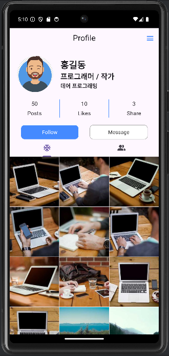
}4. 프로필 헤더 만들기
프로필의 상단에는 사용자의 이름과 직업, 사진을 보여주는 헤더가 필요합니다. 이를 Row 위젯을 이용해 간단히 구성할 수 있습니다.
import 'package:flutter/material.dart';

class ProfileHeader extends StatelessWidget {
  const ProfileHeader({super.key});

  @override
  Widget build(BuildContext context) {
    return Row(
      children: [
        const SizedBox(width: 20),
        _buildHeaderAvatar(),
        const SizedBox(width: 20),
        _buildHeaderProfile()
      ],
    );
  }

  Column _buildHeaderProfile() {
    return Column(
      crossAxisAlignment: CrossAxisAlignment.start,
      children: [
        Text(
          '홍길동',
          style: TextStyle(
            fontSize: 25,
            fontWeight: FontWeight.w700,
          ),
        ),
        Text(
          '프로그래머 / 작가',
          style: TextStyle(
            fontSize: 20,
            fontWeight: FontWeight.w700,
          ),
        ),
        Text(
          '데어 프로그래밍',
          style: TextStyle(
            fontSize: 15,
            fontWeight: FontWeight.w700,
          ),
        )
      ],
    );
  }

  SizedBox _buildHeaderAvatar() {
    return SizedBox(
      height: 100,
      width: 100,
      child: CircleAvatar(
        // 에셋이미지는 보통 위젯의 배경으로 동작할 때, 꾸밀 때 많이 활용하는 위젯이다
        backgroundImage: AssetImage('assets/avatar.png'),
      ),
    );
  }
}
5. 프로필 카운트 정보
사용자의 게시물, 좋아요, 공유 등과 같은 통계 정보를 보여주는 위젯을 만들 수 있습니다. Row와 Column 위젯을 활용하여 각 항목을 표시할 수 있습니다.
import 'package:flutter/material.dart';

// 프로필 카운트 인포 위젯 만들어 보기
class profileCountInfo extends StatelessWidget {
  const profileCountInfo({super.key});

  @override
  Widget build(BuildContext context) {
    return Row(
      mainAxisAlignment: MainAxisAlignment.spaceEvenly,
      children: [
        _buildInfo('50', 'Posts'),
        _buildLine(),
        _buildInfo('10', 'Likes'),
        _buildLine(),
        _buildInfo('3', 'Share'),
      ],
    );
  }

  Container _buildLine() {
    return Container(
      width: 2,
      height: 50,
      color: Colors.blueAccent,
    );
  }

  Widget _buildInfo(String count, String title) {
    return Column(
      children: [
        Text(
          count,
          style: TextStyle(fontSize: 15),
        ),
        const SizedBox(height: 5),
        Text(
          title,
          style: TextStyle(fontSize: 15),
        ),
      ],
    );
  }
}
5. 프로필 버튼 만들기
Follow와 Message 버튼을 만들어 봅니다. InkWell 위젯을 사용하여 터치 이벤트를 처리하고, 버튼의 스타일을 Container와 BoxDecoration을 활용하여 꾸밉니다.
import 'package:flutter/material.dart';

// 버튼 만들어 보기
class ProfileButtons extends StatelessWidget {
  const ProfileButtons({super.key});

  @override
  Widget build(BuildContext context) {
    return Row(
      mainAxisAlignment: MainAxisAlignment.spaceEvenly,
      children: [
        _buildFollowButton(),
        _buildMessageButton(),
      ],
    );
  }

  InkWell _buildMessageButton() {
    // InkWell: 터치 이벤트(탭, 더블탭) 감지하고 시각적 피드백도 제공합니다.
    // 터치하고자하는 영역을 감싸서 만들 수 있다.
    return InkWell(
      onTap: () {
        print('버튼 클릭');
      },
      child: Container(
        alignment: Alignment.center,
        width: 160,
        height: 40,
        child: Text(
          'Message',
          style: TextStyle(color: Colors.black87),
        ),
        decoration: BoxDecoration(
          color: Colors.white,
          border: Border.all(color: Colors.grey),
          borderRadius: BorderRadius.circular(10),
        ),
      ),
    );
  }

  InkWell _buildFollowButton() {
    return InkWell(
      onTap: () {
        print('버튼 클릭');
      },
      child: Container(
        alignment: Alignment.center,
        width: 160,
        height: 40,
        child: Text(
          'Follow',
          style: TextStyle(color: Colors.white),
        ),
        decoration: BoxDecoration(
          color: Colors.blueAccent,
          border: Border.all(color: Colors.white),
          borderRadius: BorderRadius.circular(10),
        ),
      ),
    );
  }
}
* 아래의 코드는 OutlineButton을 메서드로 만들어 처리해본 코드입니다.
import 'package:flutter/material.dart';
class MyProfileButtons extends StatelessWidget {
const MyProfileButtons({super.key});
@override
Widget build(BuildContext context) {
return Row(
mainAxisAlignment: MainAxisAlignment.spaceEvenly,
children: [
_buildOutlineButton(Colors.blueAccent, Colors.white, 'Follow', 160),
_buildOutlineButton(Colors.white, Colors.black87, 'Message', 160),
],
);
}
SizedBox _buildOutlineButton(
Color buttonColor, Color textColor, String title, double width) {
return SizedBox(
width: width,
child: OutlinedButton(
style: OutlinedButton.styleFrom(
backgroundColor: buttonColor,
shape: RoundedRectangleBorder(
borderRadius: BorderRadius.all(
Radius.circular(10),
),
),
),
onPressed: () {
print('팔로우합니다.');
},
child: Text(
title,
style: TextStyle(color: textColor),
),
),
);
}
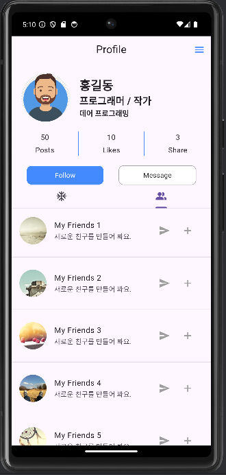
}6. 프로필 탭 구현하기
프로필 화면에서는 두 개의 탭을 만들어 TabBar와 TabBarView를 사용하여 각각 다른 화면을 표시합니다.
import 'package:flutter/material.dart';
// 상태가 있는 위젯을 만들어 보자
// 1. StatefulWidget 위젯을 상속받았다.
// 두 개의 클래스가 한 묶음이다
class ProfileTab extends StatefulWidget {
const ProfileTab({super.key});
@override
State<ProfileTab> createState() => _ProfileTabState();
}
class _ProfileTabState extends State<ProfileTab>
with SingleTickerProviderStateMixin {
// 멤버 변수
// tabController는 TabBar와 TabBarView를 동기화하는 컨트롤러입니다.
TabController? _tabController;
// 단 한 번 호출되는 메서드이다.
@override
void initState() {
super.initState();
print('프로필 탭 내부 클래스 init 호출했다');
// length 는 탭의 개수를 의미한다.
// vsync는 자연스러운 애니메이션 전환을 위해서 TickerProvider를 활용한다.
_tabController = TabController(length: 2, vsync: this);
}
// build 메서드는 기본적으로 그림을 그릴 때 호출이 된다.
@override
Widget build(BuildContext context) {
// 화면을 그려주는 영역
print('빌드 호출');
return Column(
children: [
_buildTabBar(),
Expanded(
child: _buildTabBarView(),
),
],
);
}
TabBarView _buildTabBarView() {
return TabBarView(
controller: _tabController,
children: [
GridView.builder(
itemCount: 40,
gridDelegate: SliverGridDelegateWithFixedCrossAxisCount(
crossAxisCount: 3,
crossAxisSpacing: 1, // 열 (컬럼) 사이의 간격을 10으로 설정
mainAxisSpacing: 1,
),
itemBuilder: (context, index) {
return Image.network(
'https://picsum.photos/id/${index}/200',
//fit: BoxFit.cover,
);
},
),
ListView.separated(
itemCount: 28,
itemBuilder: (context, index) {
return Padding(
padding: const EdgeInsets.symmetric(vertical: 10),
child: ListTile(
leading: CircleAvatar(
radius: 28,
backgroundImage: NetworkImage(
'https://picsum.photos/id/${index + 100}/200'),
),
title: Text('My Friends ${index + 1}'),
subtitle: Text('새로운 친구를 만들어 봐요.'),
trailing: Wrap(
children: [
_sendMessageButton(context, index),
_addFriendsButton(context, index),
],
)),
);
},
separatorBuilder: (context, index) {
return Divider(
thickness: 0.5,
);
},
),
],
);
}
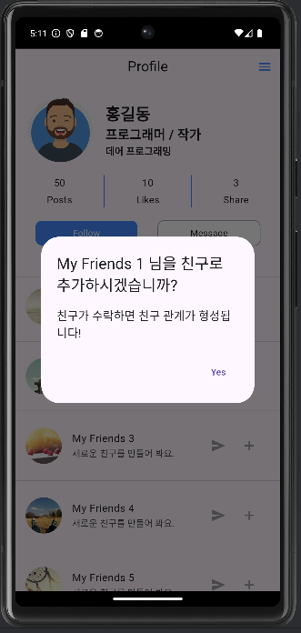
IconButton _addFriendsButton(BuildContext context, int index) {
return IconButton(
onPressed: () {
showDialog(
context: context,
builder: (context) {
return AlertDialog(
title: Text('My Friends ${index + 1} 님을 친구로 추가하시겠습니까?'),
content: Text(
'친구가 수락하면 친구 관계가 형성됩니다!',
style: TextStyle(fontSize: 18),
),
actions: [
TextButton(
onPressed: () => Navigator.of(context).pop(),
child: const Text("Yes")),
],
);
},
);
},
icon: Icon(
Icons.add,
color: Colors.grey,
),
);
}
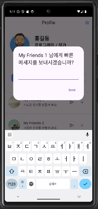
IconButton _sendMessageButton(BuildContext context, int index) {
return IconButton(
onPressed: () {
showDialog(
context: context,
builder: (context) {
return AlertDialog(
title: Text('My Friends ${index + 1} 님에게 빠른 메세지를 보내시겠습니까?'),
content: TextField(),
actions: [
TextButton(
onPressed: () => Navigator.of(context).pop(),
child: const Text("Send")),
],
);
},
);
},
icon: Icon(
Icons.send,
color: Colors.grey,
),
);
}
TabBar _buildTabBar() {
return TabBar(
// 중간 매개체로 연결
controller: _tabController,
tabs: [
Tab(
icon: Icon(Icons.ac_unit),
),
Tab(
icon: Icon(Icons.people_alt),
),
],
);
}
}7. 최종 화면
이와 같이 Flutter를 사용하여 프로필 페이지를 구성할 수 있습니다.
각 부분은 StatelessWidget 또는 StatefulWidget으로 구성되어 있으며, 이번에는 StatefulWidget 도 활용해서 flutter의 상태를 연습해보았습니다. TabController를 사용하여 탭 기능을 구현했습니다.
이를 통해 프로필 화면에서 다양한 정보를 효과적으로 표현할 수 있습니다.
아래의 문헌을 참고하여 작성된 포스팅입니다.
최주호, 김근호, 이지원(공저) 『만들면서 배우는 플러터 앱 프로그래밍』, 앤써북, 2023.